Craigslist Redesign
For a course project, my team and I were tasked to redesign Craigslist’s interface to expand the target user group.
Project Overview
The Design Process
Our first step was conducting research on the e-commerce landscape.
My team and I conducted secondary research to identify current trends in e-commerce design and to carefully analyze Craiglist’s interface to better understand the landscape using methods such as comparative analysis and heuristic evaluations.
Our summarized findings:
Craigslist did not follow current trends in terms of color schemes and other style choices - how can we alter the site visually to evoke emotions of positivity and confidence for users?
Craigslist had a dated layout and many violations of usability heuristics - where can we place things to not only appear more modern but to also provide a better user experience?
Craigslist pages had a lot of elements such as drop-down menus, paginations, radio buttons, check boxes, and much more that allowed customizing searches- how can we make all these options more concise?
Next, we conducted user testing with 3 tasks to find areas of improvement, common pain points and insights.
To understand the current user experience of Craigslist, we conducted user testing using 3 different tasks. Our tasks focused on the e-commerce aspect of Craigslist.
Each member conducted testing with a participant. All members noted the timing of each task to complete, facial expressions, and verbal expressions made by users.
The goal of noting the timing and emotions was to guide us to create sketches and prototypes that would target the pain points commonly found with the current design. For example, we found that messaging a seller took participants the longest to complete, as it was difficult to directly instant message the sellers and to complete CAPTCHA requirements.
With our research findings, we jumped straight into ideating potential solutions, and created our first prototype.
After synthesizing all research findings and user testing results, my team members proceeded to create sketches and make a style guide. I used these to create the first iteration of our new Craigslist design.
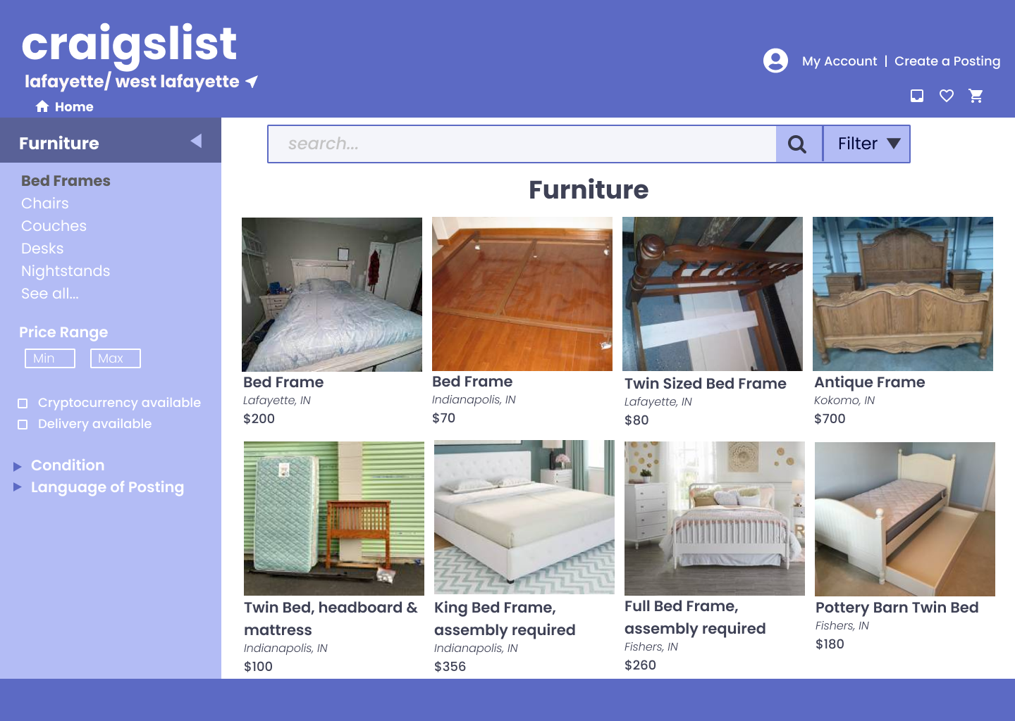
I used Figma to create three screens: A landing For Sale page, a category page, and an item listing page:
What’s the issue at hand?
Craigslist’s infamous interface has a reputation for being cluttered and dated- young shoppers tend to look at other platforms. How can we make it more appealing to younger audiences?
The solution
By improving the organization of the website, incorporating grid layouts and text hierarchy, and studying current e-commerce design trends, our final solution proved to be more desirable for a younger target audience. Our design higher desirability ratings than the current interface, shown through testing
My Role
I helped take an initial inventory of elements on Craigslist’s interface and design, used Figma to create the first round of screens, conducted user testing using tasks, and desirability testing.
Tools used
Figma, Miro, Google Suite


We used desirability testing to learn how users felt about our first design.
We tested 4 participants to associate our screen designs. They were presented with a list of words that varied from positive to negative emotions and were asked to pick out 5 that they associated each screen with.
Overall, we received positive feedback Our participants associated our design with the words “fresh” and “attractive” for the layout and color scheme. However, some of our functions were confusing such as the filtering options on the side and the search bar, so some picked the word “confusing”. Participants also thought some of the text on the item page was hard to read. Finally, some thought our design was “familiar” as they thought it was typical for a website in terms of looks.
How do users feel about our design?
After synthetizing our feedback, we made a second set of screens to further improve our design.
In round 2, we focused on tackling the suggestions and pain points presented by users.
Notable changes made based on feedback:
Text - font sizes and types were changed on the screens to provide a less cluttered look
No filter on search bar - since filtering is available on the side, this was unnecessary to keep.
Bookmarking function and slider function for price filtering - suggested by participants to include
Placement of text - rearranged grid layout to improve navigation
I assisted my team member to create one screen out of the three:


I gained a lot of UX/UI skills over the duration of this project. I was able to learn how to conduct desirability testing and how to make use of the data collected from it. I was also given the opportunity to create mock-up screens with Figma using sketches and guides from my teammates. Thanks to the help of my team members, I was able to bring out my team’s vision for an updated interface of Craigslist to the best of my ability.
There was room for improvement with my initial mock-up, and I am thankful to have received feedback on it. I will keep in mind the thoughts and tips from the feedback to grow my skills in design. I am excited to use what I have learned in the future!
Reflection and Takeaways
What’s next?
Following the final iterations, we concluded the project. Ideally, the project would have continued with the creation of high-fidelity prototypes, and additional user testing.


